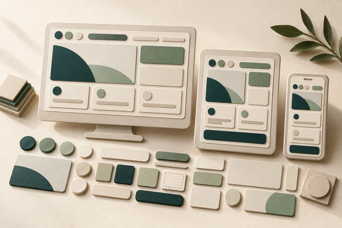
Build a practical design system around repeated workflows, documented states, multilingual content, and a gradual migration plan your team can maintain.
A growing company can begin with five consistent web pages and later add customer accounts, booking forms, and campaign pages. Each addition introduces another button style, another status label, and another interpretation of success. The problem is not merely visual. Customers may have to learn different behavior whenever they move between related tasks. A design system brings shared decisions, interface components, and usage guidance together. Its first purpose should be solving repeated problems, not producing an impressive library nobody uses.
Decide whether the business needs a system
A rarely updated brochure website maintained by one person may only need basic typography, color, and spacing rules. The case for a system becomes stronger when several people build connected interfaces. Look for concrete symptoms: three treatments of required fields, different meanings for “complete,” or the same defect repaired separately in several forms. Write down the cost you want to reduce. That gives the work a boundary and prevents an attractive documentation project from replacing more urgent product improvements.
Inventory a customer journey, not every screen
Consider a fictional maintenance company offering inspection requests, repair tracking, and technician messaging. Capture the journey for creating, editing, and canceling a request. List repeated elements such as address cards, phone inputs, appointment selection, and confirmation messages. Record where each appears, what currently goes wrong, and who owns it. Choose the journey generating the most confusion. A one-off seasonal campaign can remain outside the first release.
The official GOV.UK component library pairs reusable components with usage guidance and implementation examples. That is a useful documentation model, not a reason to copy government styling into your brand. Your appointment selector might need to establish the service area before showing available times. That requirement comes from the business workflow, not from the appearance of a calendar in somebody else's library.
Separate foundations, components, and task patterns
Start with three modest layers. Foundations define type, color, spacing, and borders. Components include inputs, alerts, and buttons. Patterns combine components to complete a task, such as submitting a request. Name colors by purpose: primary text, quiet surface, main action, warning. Functional names survive a dark theme better than “new blue.” A button size can be a variant, but a navigation link should not silently become a form submission button because the two happen to look alike.
Document the uncomfortable states
A useful component describes more than its successful appearance. For a phone input, specify its label, assistance, error, long value, and paste behavior. For submission, include waiting, repeated activation, failure, and retry. For a request card, distinguish saving a draft from sending it and from the team receiving it. These distinctions stop a reassuring green badge from making a promise the underlying system has not fulfilled.
- Explain the component's purpose and when not to use it.
- Include realistic long content, not only short demonstration labels.
- Define keyboard behavior, focus, and relevant status announcements.
- Identify the data source and who can change its state.
- Connect the design example to the implementation and its protective tests.
Build in languages and accessibility
Try Arabic, English, and Turkish before approving the component. A Turkish service name may take more space; an Arabic card may combine right-to-left prose with a left-to-right email address. Do not mirror every icon automatically. Establish whether it represents direction. Test enlarged text, keyboard operation, and several simultaneous errors. W3C's contrast guidance addresses the relationship between text and its background; a brand palette alone cannot establish readable interface combinations.
Migrate one complete workflow
The maintenance company chooses three forms sharing contact information. The team implements one phone component, then introduces it in inspection requests only. Support reviews incoming requests, a developer checks that failed submissions preserve the number, and a designer checks long content on mobile. Once this journey works, the component moves into the other two forms. A genuine difference, such as international versus local numbers, becomes a documented option rather than an unexplained fork.
Plan reversal as well. Record affected pages, component versions, and how to restore earlier behavior if a defect appears. Old screens can remain functional while migration proceeds, but new copies of their outdated patterns need a reason. Migrating a complete journey creates useful evidence. Repainting every button at once may improve screenshots without addressing the request confusion that justified the work.
Give changes a clear owner
Assign someone to coordinate design, development, and content decisions, not to forbid exceptions. A proposal should describe the problem, its repeated locations, why existing components are insufficient, and how the alternative was tested. GOV.UK's contribution criteria require evidence of usefulness and avoid duplicating existing solutions. Your smaller system can apply that principle through a short review while allowing a local experiment that is not yet ready for general adoption.
Measure practical outcomes
Compare conflicting input implementations, repair effort, and recurring support questions before and after migration. Record the period and other concurrent changes; do not attribute an entire sales increase to standardized buttons. Early success might mean one repair reaching three forms or one clearer message removing a common misunderstanding. Keep a deferred-pattern list so the library does not become a separate product competing for the team's attention.
Start with a limited scope and components used in actual work. The website brief guide helps identify initial journeys, while the digital brand identity guide connects operational choices with brand character. A successful design system does not make every screen identical. It makes important decisions understandable, consistent, and maintainable as the business changes.
This article was prepared with AI assistance. Examples are hypothetical, and official sources are linked to the points they support. It is not an audit of a particular product.