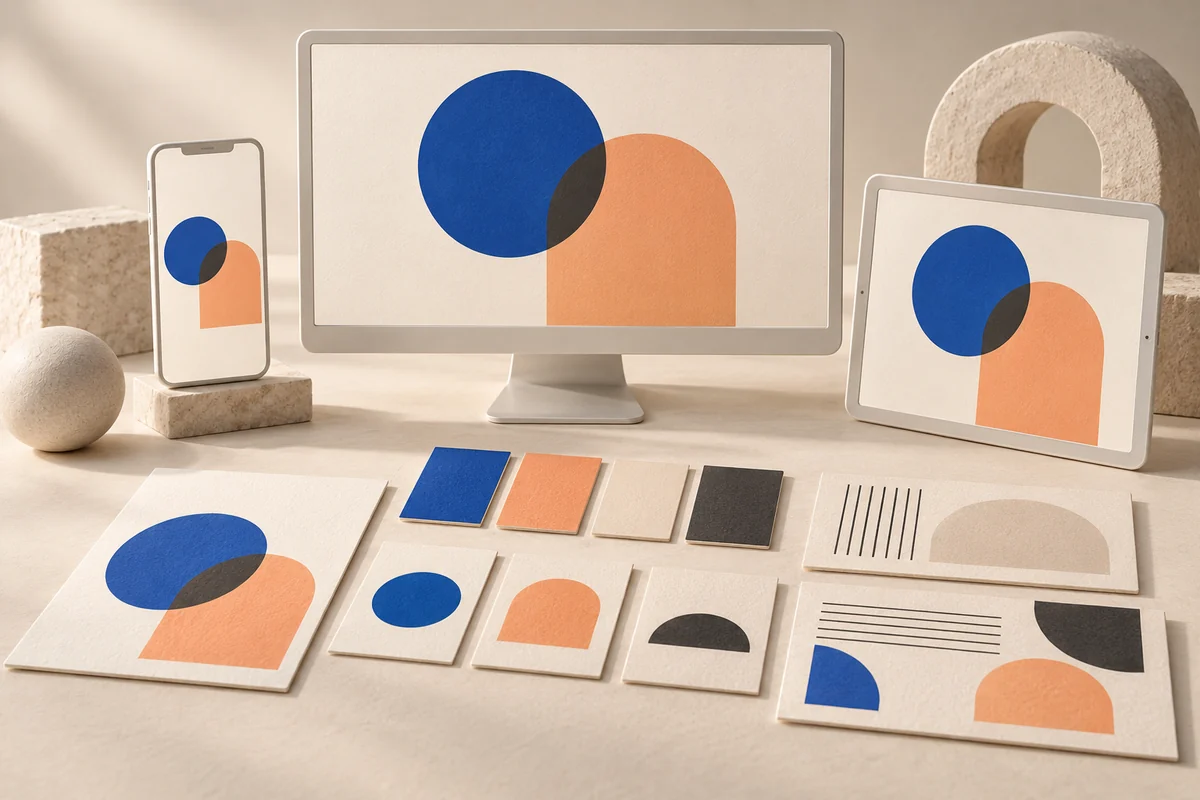
Translate your brand into usable digital decisions: functional color, multilingual typography, honest imagery, clear voice, and a practical handover checklist.
A logo helps visitors recognize a business, but it cannot explain the service or make every interaction trustworthy. Digital identity also appears in pricing presentation, error messages, photography, and the space between important details. An elegant advertisement can lead to a crowded application that feels like a different company. Building a brand identity for websites and apps means translating character into repeatable decisions people can use. A folder containing a logo and several colors is only part of that work.
Start with a promise the product can demonstrate
Imagine a fictional furniture studio producing made-to-order pieces. Its team chooses three qualities: precise, warm, and clear. Each needs a practical expression. Precision means visible dimensions and materials. Warmth means respectful language and images connected to everyday use. Clarity means explaining the ordering process and which decisions need customer approval. “We are the best” gives a designer little direction. “Explain customization limits before a request is sent” establishes something the interface must actually show.
Also describe what the brand should avoid. The studio might reject inflated luxury language or artificial countdowns. These boundaries help a temporary campaign remain recognizable. Use actual customer questions when available, separating evidence from team assumptions. For a new business, label assumptions honestly and test them with prospective users. Do not invent interviews or satisfaction figures to justify a visual direction already chosen.
Design information hierarchy before decoration
A table's product page should explain its name, dimensions, material, customization options, and quotation process. A beautiful photograph can occupy generous space without hiding those details behind a lengthy animation. Give the heading a clear level, supporting information less emphasis, and the main action a predictable position. Ask whether a visitor can explain the product and next step without reading every paragraph. A calm identity does not require tiny, faint text; a bold identity does not require every element to compete.
Give colors functional jobs
The studio could choose a clay accent, warm backgrounds, and dark text. The accent does not need to color everything. Separate brand expression from error, success, and focus states, and document permitted text and button combinations. W3C's color guidance says meaning must not depend on color alone. A green dot should therefore not be the only explanation of an order's state; add a label such as “Awaiting dimension approval.”
W3C's contrast guidance addresses text readability against its background. Evaluate colors at their actual size and location, not merely as large presentation swatches. A pale shade can remain useful in illustrations or decorative surfaces while a darker version carries text. This preserves the character without asking customers to strain to read conditions or an action label.
Test typography in all required languages
Do not approve a font because its name sounds appropriate or a short English headline looks attractive. Try Arabic product names, prices, delivery addresses, and email addresses, followed by Turkish text containing characters such as ğ, ş, and ı. Examine regular and bold weights, numerals, and punctuation. Arabic and Latin families need not look identical; they should share a compatible rhythm and level of clarity. Keep product explanations as real text rather than embedding them inside images that are difficult to enlarge, translate, or update.
Treat imagery as part of the offer
Set photography rules covering lighting, background, distance, and how scale or material will be demonstrated. The fictional studio could combine a whole-table photograph, a close view of a wooden joint, and an everyday setting. Clearly distinguish a generated interior or three-dimensional concept when it could be mistaken for a completed product. Do not present generated pictures as real customer work or show extras outside the price without explaining the distinction.
Original generated artwork can support an educational article or conceptual theme, but it does not replace product evidence. Describe an image according to what it shows and why it matters, rather than filling its alternative text with search terms. Test card-image crops on mobile. If cropping removes the object that explains the idea, revise the composition or focal point instead of assuming the screen is at fault.
Write a voice that survives failure
Turn the brand qualities into message examples. Instead of “Unexpected error,” a suitable message might explain that the request was not sent, whether entered details remain, and how to retry. Never promise saved details unless the application actually preserves them. The studio may prefer “Request a quote for your dimensions” to an exaggerated invitation to buy a masterpiece. Waiting, failed submission, and payment uncertainty reveal brand character as much as the homepage does.
- Choose a consistent form of address without forcing unnatural translations.
- Name actions by their outcome: review dimensions, send request, download specifications.
- Separate confirmed information from estimates for timing, price, and availability.
- Explain how to correct unexpected input without blaming the customer.
- Allow operational messages to be brief rather than making every message promotional.
Deliver a usable identity kit
Include logo files for different backgrounds, color roles, font licenses, image guidance, and examples of buttons, forms, and states. Provide short voice examples and longer content that exposes translation problems. Developers should know which asset to use, and editors should be able to add a page without inventing another style. A design system extends this kit when components recur across the website, app, and customer account.
Test a task, not just visual preference
Show a product page, confirmation message, and tracking screen. Ask someone to identify what needs approval and how to request a change. Observe hesitation and unexpected interpretations. Describe findings as evidence from that limited session, not conclusions about every customer. Repeat on mobile, in another language, and during failure. The answer may be a clearer heading or darker text rather than a new logo. Connect identity decisions to a project brief and launch checklist. A strong digital identity makes its behavior match its promise, including the ordinary screens.
This article was prepared with AI assistance. The studio and scenarios are hypothetical, not client case studies or measured business results. Official links support the specific points beside them.