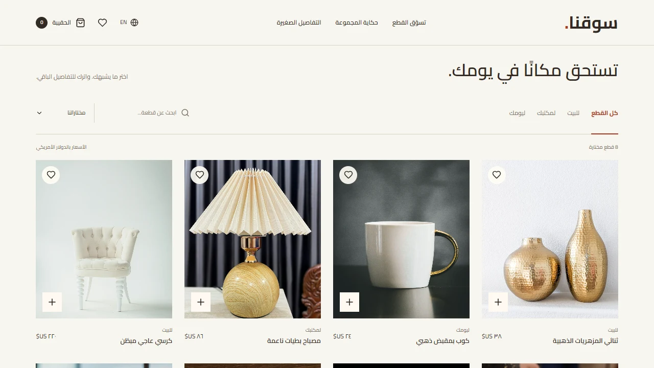
A practical guide to product images, specifications, variants, price, and delivery, with a worked example and a checklist for reviewing the page before launch.
A product page is where interest becomes practical questions. Will this fit? What arrives in the box? What will the whole order cost? When could it reach me? If the answers sit in separate messages or ambiguous photographs, the customer must pause and investigate. Build the page around those questions, giving each image and paragraph a clear job in the buying decision.
Make the first decision easy to understand
Bring together a descriptive product name, a clear image, the price and currency, available options, and the add-to-cart action. On a phone, customers should understand how these pieces relate. Show the selected size or colour and its availability. A change in option should reveal any price difference before the customer continues.
“The Signature Collection” may express a brand, but it does not explain the item. “Adjustable desk lamp with a metal base” does. Use the collection name alongside a useful description. When an option is unavailable, explain its status and give a relevant next step without suggesting that it can still be ordered.
Turn specifications into usable answers
Imagine preparing a reading-lamp page. This is an editorial example, not a specification for a product on sale. Collect the actual base dimensions, height, cable length, plug type, and box contents from the product source. Then ask whether customers can work out how much desk space it needs and whether they must buy a bulb separately. A measurement is more useful than “perfect for every space.”
- Describe the intended use before presenting detailed specifications.
- Give dimensions with units and explain how they are measured when necessary.
- Separate included items from accessories used to style a photograph.
- Explain compatibility or operating requirements if another device is needed.

Use images to answer different questions
Show the actual item from useful angles, add a close view of its material, and explain scale where needed. Keep the colour and quantity consistent with the selected option. A beautiful room photograph does not replace a clear view of the product. Label illustrative scenes so customers can distinguish the item they are buying from surrounding furniture or decorations.
Explain the cost and delivery conditions
State the currency and explain where shipping is calculated and which additional charges apply. Separate preparation time from transport time. Provide the real return conditions and exceptions through a clearly named link. If timing depends on the delivery address, say so instead of presenting one estimate as a promise for every location.
Keep search information consistent
Product structured data can help Google understand prices, availability, and variants; it does not guarantee enhanced search results. Follow Google's product data guide and keep the technical information aligned with the visible page. Do not add ratings or discounts that the page cannot substantiate.
Review one complete product journey
- Use a phone to identify the item, selected option, and price without zooming.
- Switch between available and unavailable options, checking the image, action, and cart.
- Ask someone unfamiliar with the page to explain what will arrive and what remains unclear.
- Check image loading with the mobile website speed guide.
- Continue with the secure checkout guide to keep product and order information consistent.
Start with the product that generates the most repeated questions for your team. Apply what you learn to the remaining catalogue. You can explore website templates in the store to compare how different layouts present the information your customers need.