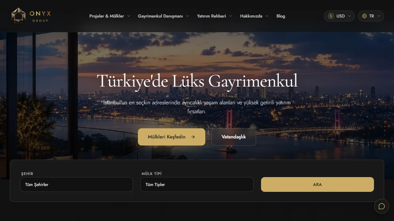
Organize your homepage around the customer’s questions: what you offer, who it serves, why they can trust it, and what happens next.
A useful business homepage helps visitors decide whether your business fits their needs and choose a clear next step. Before writing it, select the audience you want to serve first and the task you want to support: exploring a service, finding products, or requesting an appointment. Other journeys can remain available, but their visual priority should reflect your actual business priorities.
If you are still choosing how customers will access your service, compare a website and mobile app before shaping the homepage around that journey.
Write an offer customers can explain back
Use a concrete structure: a specific service for a specific audience, with coverage or delivery details where relevant. A hypothetical maintenance company might describe air-conditioner servicing for homes and offices in Istanbul, with appointments arranged after checking the address and equipment. That gives customers useful information while leaving technical detail to the service page.
Add one sentence addressing an early concern: whether the visit is included, how pricing is established, or what the customer needs to prepare. Avoid unsupported deadlines and guarantees. Match the main button to what really happens. “Request an assessment” and “Confirm a booking” describe different commitments when staff must review submissions.

Order sections around questions that precede a decision
- Core offer: identify the service or product, intended audience, and relevant coverage limits.
- Options: introduce the main services or categories with names customers can distinguish.
- Evidence: show authorized work examples, a clear process, or verified testimonials used with permission.
- Getting started: explain the information needed and what happens after submission.
- Practical answers: address recurring questions about pricing, coverage, or changes.
- Next step: repeat the appropriate action once visitors have enough context.
Treat this as a starting arrangement. A large catalogue may need search and categories early; a complex service may need more explanation. If most customers want two services, give those prominence while keeping the remaining options easy to find. Review that priority when customer needs change.
Make trust verifiable
Describe your actual role in genuine projects and distinguish template imagery from client work. If you have no reviews yet, explain the process, delivery scope, and working contact channel honestly. Publish customer names and numerical results only when you can substantiate them and have permission to use them.
W3C’s heading guidance explains that headings communicate organization and support navigation. Use descriptive section titles and a meaningful heading hierarchy. Also review mobile reading and keyboard navigation, especially menus and enquiry forms.
Run a small test before approval
Ask someone unfamiliar with the business to describe the service, intended customer, and next step after viewing the page. Let them complete that step through to confirmation. Record confusing wording, unnecessary fields, and unclear promises. After launch, review completed enquiries and their quality. A button click alone does not establish that a usable request arrived.
Collect copy and evidence in your website brief. Use the template-versus-custom comparison to choose a design foundation, then apply the launch checklist to links and forms. Include the agreed message and main action when you request your website.